

Trading Education
Apr 15, 2025

A chart pattern is a visual formation on a price chart that provides insight into where prices might move next. These patterns reflect market behavior by forming patterns over time. These patterns give clues about what price might do next, helping you spot potential continuations or reversals in the market.
But here’s the thing — chart patterns alone shouldn’t be the only reason to enter a trade. They are just one piece of the puzzle. You should always combine chart patterns with other market factors like trends, volume, and key price levels.

Chart patterns are price formations that develop as buyers and sellers interact in the market. They appear across all timeframes, from daily charts to minute-by-minute movements, making them useful for all types of traders.
These patterns tell a story about who is in control — buyers or sellers — and can help traders anticipate the next move. Some patterns suggest that prices will keep moving in the same direction, while others warn that a trend might be about to reverse.
As a trader, your job is to recognize these patterns, understand what they represent, and use them alongside other tools.

Chart patterns help you understand what might happen next in the market. But remember, patterns don’t guarantee anything — other things like volume, market trends, and news also matter.
Here’s why chart patterns are useful:
Help find good trades: Patterns can show when a stock might be getting ready to go up or down, helping traders decide when to buy or sell.
Show where the price might go: By spotting patterns, you can get an idea of whether a stock will keep moving in the same direction or change.
For example, let’s say you spot a double-top pattern forming. This pattern suggests that after reaching a certain level twice, the price might drop. By recognizing it early, you can prepare for the move and trade accordingly.
But don’t trade just because you see a pattern. Always check other things like volume and market conditions to make sure the pattern is strong. Patterns help, but they work best when used with other tools!
The #1 Mistake Traders Make with Chart Patterns

A lot of traders make the mistake of trading patterns in isolation — meaning they only look at the pattern and ignore everything else.
This is a big mistake.
Just because a pattern appears doesn’t mean it will work! You need to check other factors like volume, trends, and market conditions.
For example, if a bullish pattern appears but the stock has bad news or is in a strong downtrend, the pattern might fail.
Types of Chart Patterns
There are two main types of chart patterns:
Continuation patterns – Indicate that the trend is likely to continue.
Reversal patterns – Signal that the trend may be about to change direction.
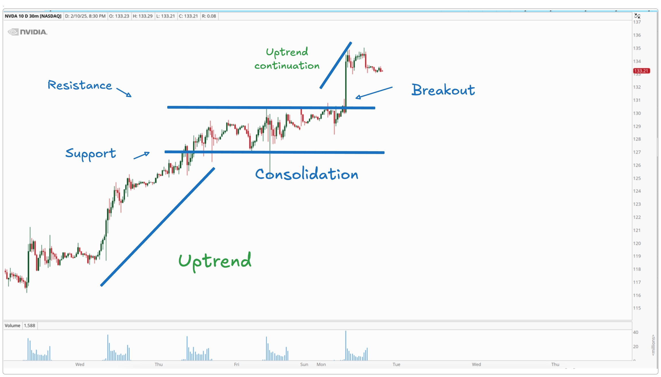
A continuation pattern forms when the price takes a break before continuing in the same direction. Think of it as a resting phase, where buyers or sellers regain momentum before pushing the price further.
These patterns often appear during an uptrend or downtrend when the market slows down for a while but doesn’t fully reverse. Once the pattern is complete, the price usually breaks out in the same direction as before, confirming that the trend is still intact.

Here is how it looks on the actual chart

But here’s the catch — not all continuation patterns lead to a continuation. Sometimes, market conditions change, and price breaks out in the opposite direction, causing a trend reversal instead. That’s why it’s always important to wait for confirmation before making a trade.
A reversal pattern signals that a trend might be coming to an end. Unlike continuation patterns, which show the price taking a pause before continuing, reversal patterns show that buyers or sellers are losing strength and that the market could be gearing up for a trend change.
These patterns often form after a strong uptrend or downtrend, where the price starts to slow down and struggle to make new highs or lows. When the pattern completes, the price may move in the opposite direction, marking the start of a new trend.

Here is how it looks on the actual chart

However, just like continuation patterns, not all reversal patterns guarantee a trend change. Sometimes, external factors like news or major economic events can cause prices to continue moving in the same direction despite the pattern forming. That’s why it’s always smart to use other confirmations — like volume and key price levels — before assuming a trend reversal is about to happen.
Now, let's look at some of the chart patterns.
A rectangle pattern happens when the price moves between two horizontal levels, creating a clear range where buyers and sellers keep the market balanced. The top line acts as resistance, stopping the price from going higher, while the bottom line acts as support, stopping the price from going lower.
For a rectangle pattern to be valid, the price needs to touch both the support and resistance levels multiple times. These levels don’t have to be perfectly straight in real-world charts — they might have a slight slope, but the general idea remains the same.

This pattern represents a battle between buyers (bulls) and sellers (bears). The market is consolidating, meaning it’s taking a break before deciding on its next move.
The Rectangle pattern can act as either a continuation or a reversal pattern, depending on how the price breaks out.
If it is a reversal pattern, the price is trending in one direction before the rectangle, but instead of continuing, it breaks out in the opposite direction. This means the trend has lost strength, and the market is changing direction. Rectangles that form at the top or bottom of a trend are more likely to turn into reversals, similar to patterns like Double Tops or Double Bottoms.
If it is a continuation pattern, the price was already trending in one direction before the rectangle formed. After consolidating between support and resistance, the price breaks out in the same direction as the previous trend, continuing its move. This happens because the market was just taking a short pause before resuming its trend. Continuation rectangles are more common when the market is already in an uptrend.
If the pattern is a continuation, it can be either a bullish rectangle or a bearish rectangle.
Forms during an uptrend when the price consolidates before breaking higher. The breakout confirms that buyers are still in control, and the trend is likely to continue.

Here is how it looks on the actual chart
Forms during a downtrend when the price moves sideways before breaking lower. The breakout confirms that sellers are still in control, and the trend is likely to continue downward.

Here is how it looks on the actual chart

Double Top and Bottom are the reversal patterns and signals that a trend is about to change direction after a strong move, either up or down.
Let's take a look at both of them.
A double top is a chart pattern that signals a possible trend reversal after the price has been moving up for a while. It forms when the price tries to go higher twice but fails at the same level, showing that buyers are losing strength.

The price moves up in an uptrend until it reaches a high point where it struggles to go higher. This creates the first top. After that, the price pulls back and finds support at a lower level, called the neckline.
Buyers try again to push the price back up, but they fail to break above the first top. This forms the second top, a sign that buyers are running out of power.
The pattern is only confirmed when the price breaks below the neckline with strong selling pressure. This confirms that sellers are in control, and the price is likely to drop further. If the neckline doesn’t break, the pattern is not valid, and the price may continue moving sideways or even go back up.
A double bottom is a chart pattern that signals a possible trend reversal after the price has been moving down for a while. It forms when the price tries to go lower twice but fails at the same level, showing that sellers are losing strength.

The price moves down in a downtrend until it reaches a low point where it struggles to go lower. This creates the first bottom. After that, the price bounces up and finds resistance at a higher level, called the neckline.
Sellers try again to push the price lower, but they fail to break below the first bottom. This forms the second bottom, a sign that sellers are running out of power.
The pattern is only confirmed when the price breaks above the neckline with strong buying pressure. This confirms that buyers are in control, and the price is likely to rise further. If the neckline doesn’t break, the pattern is not valid, and the price may continue moving sideways or even drop again.
The head and shoulders pattern is a trend reversal formation that signals a potential shift from an uptrend to a downtrend. It forms when the price makes three peaks: a left shoulder, a higher head, and a right shoulder that fails to break higher.
But here’s the thing — it won’t always look perfect. The peaks might not be exactly the same, the neckline might be slightly tilted, and sometimes the right shoulder forms higher or lower than the left. That’s normal. What matters is the overall structure and confirmation.
The neckline is the key level. It connects the lowest points between the head and shoulders and acts as support. When the price breaks below the neckline with strong selling pressure, that’s the confirmation of the pattern.

The inverse head and shoulders are the opposite — it signals a potential downtrend reversal into an uptrend. Instead of peaks, the price forms three valleys: a left shoulder, a lower head, and a right shoulder that fails to push lower.
Just like the regular pattern, it won’t be textbook perfect. The lows might not be exactly the same, the neckline could be tilted, and the right shoulder may form higher or lower than the left. The key is to focus on the bigger picture.
The neckline connects the highest points between the shoulders and the head. A breakout above the neckline with strong buying pressure confirms the pattern. No break, no trade.

Chart patterns can give you clues about where the market might go, but they shouldn’t be traded alone. Just because a pattern forms doesn’t mean the price will always move as expected. They should be used along with support and resistance, volume, and overall market trends
Patterns are a useful tool, but they work best when combined with other factors, not on their own.
Trading chart patterns properly is more than just spotting a shape and placing a trade. You need a step-by-step approach:
Spot the pattern
First, identify a clear chart pattern forming on the chart. Make sure it actually looks like a real pattern and not just random price movement.
A pattern is more reliable if it’s supported by strong volume.
If volume is high, it means more traders are involved, making the move stronger.
If volume is low, the pattern may be weak and could fail.
Also, check if the stock is moving with the overall market trend. A bullish pattern in a bearish market might not work well.
Don’t just focus on one small timeframe. Zoom out!
A pattern might look strong on a 5-minute chart, but if the hourly or daily chart shows the opposite, it may not work.
Before entering, set up a plan:
Where will you buy or sell?
Where will you exit if the trade goes wrong?
Where will you take profits?
Having a plan helps you stay disciplined and avoid emotional mistakes.
Once everything lines up, take the trade. Don’t jump in too early, and don’t ignore your stop-loss if the trade doesn’t work out.

